
"The grays I use are not dull and display the art of discretion in all tones. I love the mineral and economical aspect of neutral grays as much as the natural distinction of colored grays, these desaturated colors which simply reveal their origins. Enchanted with blue, oxidized with green or in fusion with the earth, in their world of textures, my grays are much more than the simple addition of black and white."
Sarah Poniatowski


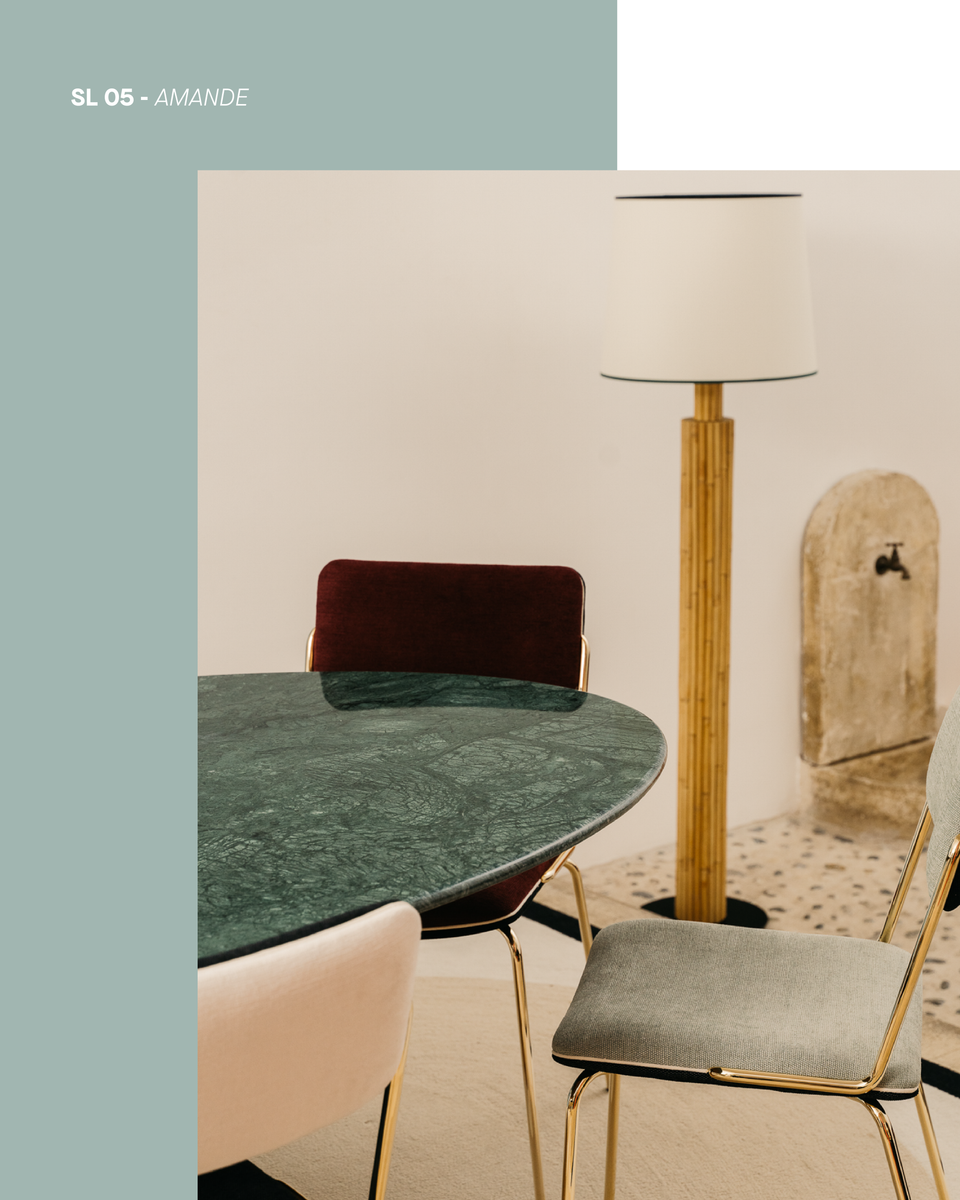
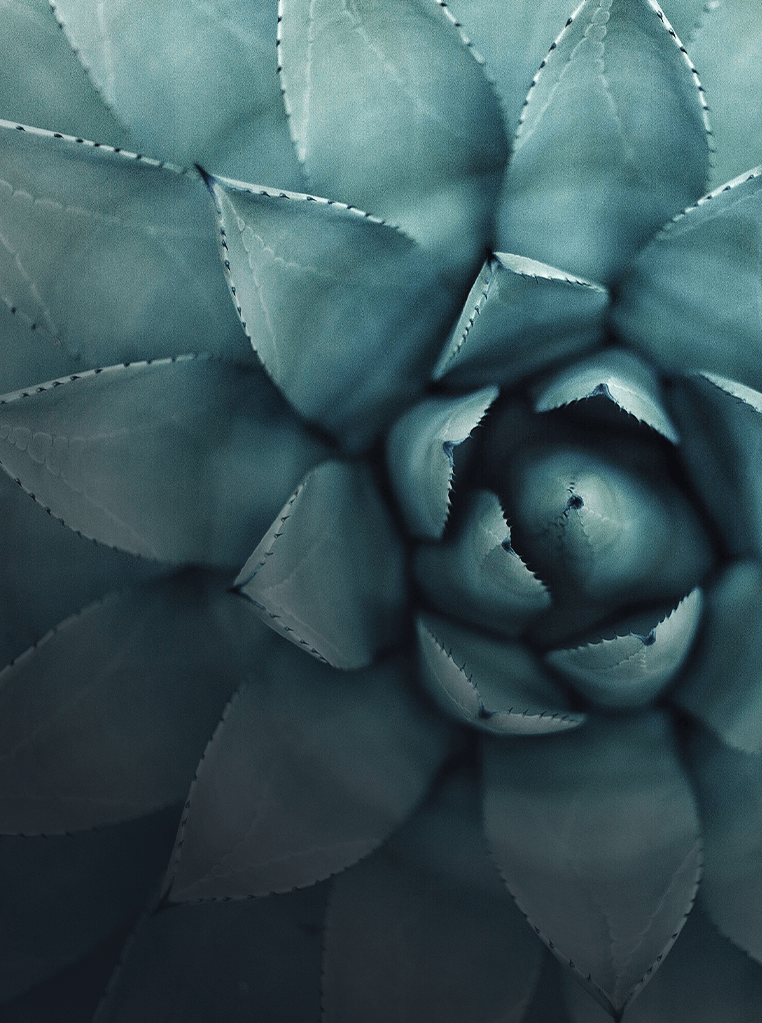
This shade of verdigris, slightly bluish and muted, is a chameleon shade that reveals the complexity of your face depending on the shades with which it is associated. Indoors, it is a tender and soothing color, like watercolor.
Delicately colored like jade and cetadon, the Almond shade is ideal for those who are more cautious and seek, above all, the sweetness of life.
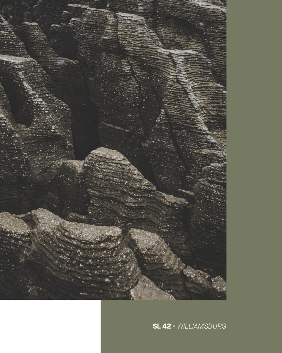
In the armada of shades of gray, Williamsburg is a military camp khaki, desert storm atmosphere. Its recipe, red + green + yellow, makes it a refined, golden colored gray tending towards bronze rather than green.
Williamsburg is a tactical and peaceful color to bet on, in a total look for a masculine atmosphere or in a feminine duo with soft pinks

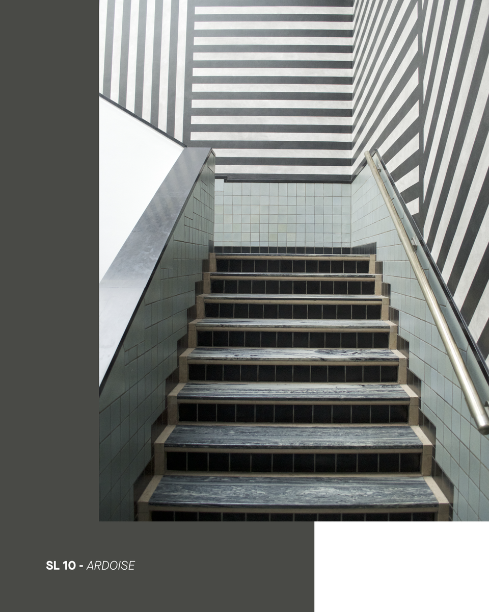
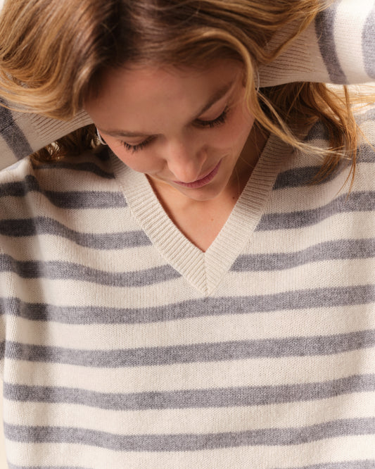
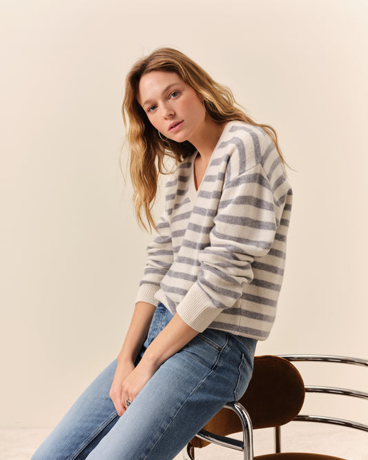
Dark yet luminous, this ashy shade climbs the gray range to reach the peaks of slate and basalt. Highly mineral, it is a solid, masculine gray crowned with blue and yellow. Its muted depth, the color of an elephant’s skin, brings our gray matter into line. Nonchalantly!
-
Novelty
-
-
-
-
-
-
-